The SimplyfAI Guide to Prediction Markets

Let’s rewind to Christmas Vacation 2025.
You arrive at the family function like you’re stepping into a heavyweight title fight. You’ve trained. You’ve studied. You’re not getting embarrassed this year.
Because you remember the previous incidents.
There was the year you passed your MBA and celebrated like you’d won Olympic gold, only for your nephew, that small-lawless goblin, to say: “Doesn’t everyone pass those?” like he was commenting on the weather.
Then Christmas 2022. He shows you ChatGPT. You’re convinced there’s a human on the other side. You spend ten minutes being polite to a machine like it’s a Telkom call centre with feelings.
You tell yourself it’s not your fault. If you’d taken a gap year, you’d probably also know the ins and outs of the blockchain. You’d also have opinions about “decentralised futures” and “digital identity” you can’t fully explain.
But this time is different.
This time you came prepared. You’ve gone through Microsoft Copilot in painful detail. You’ve familiarised yourself with agents. You’ve got jargon loaded in the chamber. You’re ready to throw a curveball back. Maybe ask him about design thinking. That’s advanced. That’s corporate judo.
And then, before dessert, he hits you with two words you did not train for:
“Polymarket.”
“Kalshi.”
And suddenly the malva pudding tastes like defeat.
If you’ve been lucky enough to avoid this situation so far, don’t get comfortable. Prediction markets are here. They’re growing fast. And they’re one of the cleanest ways to watch a crowd turn messy information into a single number.
At SimplyfAI, we simplify complex concepts for a living, so consider this your calm, practical guide: what prediction markets are, how they work, and how we plan to use them as a new signal source in our data pipelines.
What are Prediction Markets?
A prediction market is basically a live-updating bet that looks like a stock price.
You’re not buying a company. You’re buying a probability.
- If a market says “Yes” is trading at 0.30, that’s the crowd saying 30% chance.
- If it jumps to 0.55, the crowd just got more convinced.
That’s it. It’s a scoreboard for belief.
And the reason it’s interesting is simple: money forces honesty. People can joke online for free. They can’t joke as easily when they have to pay for their opinion.
Polymarket vs Kalshi: what’s the difference?
Both are prediction markets, but they feel like different neighborhoods.
Polymarket
Polymarket has more of a “global crypto-native” vibe. It’s fast-moving, meme-aware, and you’ll often see markets that are:
- more experimental
- more global
- more internet-culture adjacent
It often behaves like a place where traders treat news like a sport.
Kalshi
Kalshi leans more “regulated, US-finance coded.” The markets tend to look cleaner and more institutional, especially around:
- macro data releases
- rates
- structured event contracts
It feels like the crowd is less chaotic, more spreadsheet.
That difference is exactly why we got curious.
Because if the crowds are different, the timing might be different too.
And timing is the whole game.
A quick case study: Who moves first?
We asked a simple question:
When odds move on both platforms for comparable markets, does one platform tend to move first?
Not “who’s more accurate.”
Not “which one you should bet on.”
Just: who reacts faster.
That’s a tiny question with big implications, because if one market consistently leads the other, it becomes a signal.
At SimplyfAI, signals are our bread and butter. We build pipelines that take noisy data, clean it up, and turn it into something you can actually use. Prediction markets are basically a new sensor for the world: a belief sensor.
So we built an exploratory pipeline that:
- finds comparable markets
- aligns their odds over time
- measures lead/lag
- and produces a weekly report with charts you can read without a PhD
And yes, we did it partly for fun. The best way to learn an ecosystem is to build something that touches the edges and breaks a few times.
Next up: the “Polymarket vs Kalshi: Who Moves First?” experiment, what we found, and what it means for our broader data stack.
What we’re testing (the simplest version)
We’re building a Lead-Lag Index.
Think of it like this:
- You’ve got two crowds watching the same story.
- They update their beliefs at different times.
- We’re trying to measure the average “head start” one crowd gets over the other.
If Polymarket tends to move first, we call that a positive lag.
If Kalshi tends to move first, that’s a negative lag.
We focused on markets in roughly the same universe: macro, rates, central bank decisions, nominations. The kind of stuff that reacts fast to headlines and rumors.
How we did it (without the algebra headache)
Here’s the pipeline in plain English:
- Find comparable markets
- We start on Kalshi with a keyword universe (CPI, inflation, Fed, jobs, rates, etc.).
- For each candidate, we search for the closest Polymarket market.
- Make sure we’re matching apples to apples
- Title similarity (fuzzy matching)
- Numeric/comparator alignment (like “above 2.5%” vs “over 2.5%”)
- One-to-one pairing (one Kalshi market gets one Polymarket match)
- Put them on the same timeline
- We resample both to a common grid (scrape at 1-minute, analyze at 5-minute).
- We forward-fill probabilities on the grid so we can compare like-for-like.
- Measure who moves first
- We convert probabilities into “returns” (how fast beliefs change).
- Then we slide one series forward and backward and ask:
At what shift do they line up best? - We run sanity checks so we don’t fool ourselves:
- stability across different bar sizes (5m vs 15m)
- conservative multiple-testing controls (FDR)
A key point: this is a hard problem because these markets don’t update smoothly. Sometimes one platform stair-steps. Sometimes a market barely trades. Sometimes the “same story” is priced differently.
So we don’t pretend the first draft is gospel. We treat it like a metal detector: it beeps, then you still have to dig.
The headline result (Week view)
For the last 7 days, we didn’t get enough statistically strong “Tier A” signals to declare a winner.
So the report uses a tier system:
- Tier A: significant + stable (publishable confidence)
- Tier B: “suggestive” (still interesting, but handle with care)
This week:
- LLI: N/A (no Tier A signals)
- Suggestive LLI (Tier B): ~36 minutes (95% CI 13.71 to 50.77)
That’s not “proof”, but it is directionally interesting: in this window, the better-looking alignments leaned toward Polymarket moving earlier, especially in “rates”-type markets.
What the distribution looks like
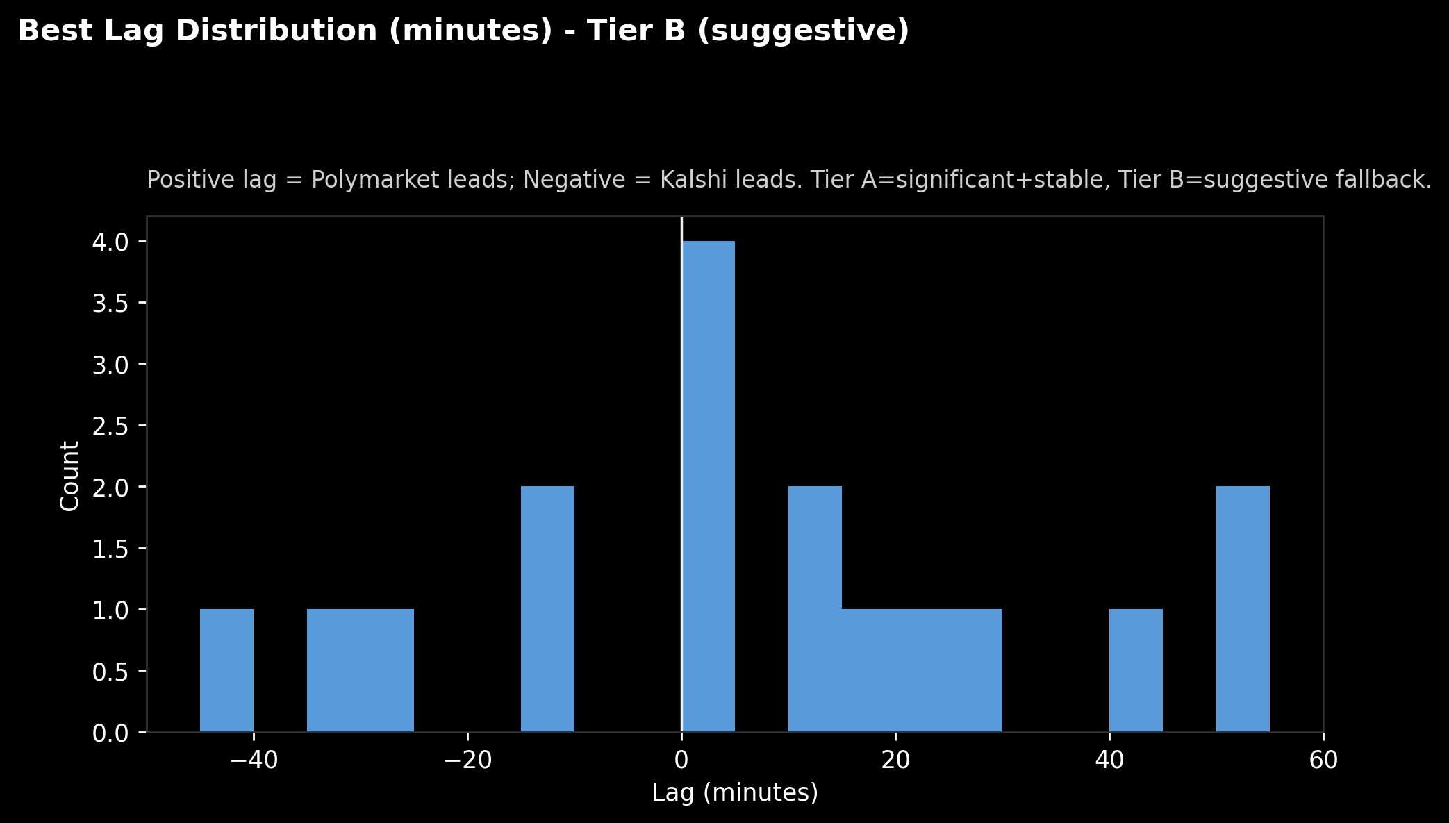
Caption: “Best Lag Distribution (Tier B). Positive = Polymarket leads, Negative = Kalshi leads.”
This is the “bag of lags”. Each matched pair gets a “best lag” value.
What jumps out:
- Plenty of pairs cluster near 0 minutes (both move around the same time or don’t really move at all).
- There are also a handful out at +40 to +55 minutes, which is where that “Polymarket leads” vibe comes from.
- And yes, there are negatives too. It’s not one-way traffic.
A clearer way to read it: bins and balance
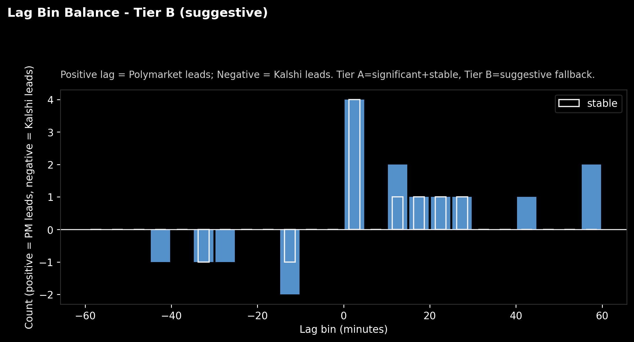
Caption: “Lag bins. Above zero means more pairs where Polymarket looks earlier; below zero means Kalshi looks earlier. White outline marks ‘stable’ pairs.”
This is the same information, but easier to digest:
- Bars above the line: more “Polymarket leads” pairs in that lag bucket.
- Bars below: more “Kalshi leads” pairs.
The outlined bars matter most. They are the subset that didn’t flip wildly when we changed the analysis granularity (a basic stability check).
If you’re a normal human: this chart is basically saying,
“there are a few more ‘Polymarket ahead’ beeps than ‘Kalshi ahead’ beeps this week, but we’re not calling it a win yet.”
Which specific pairs are doing the work
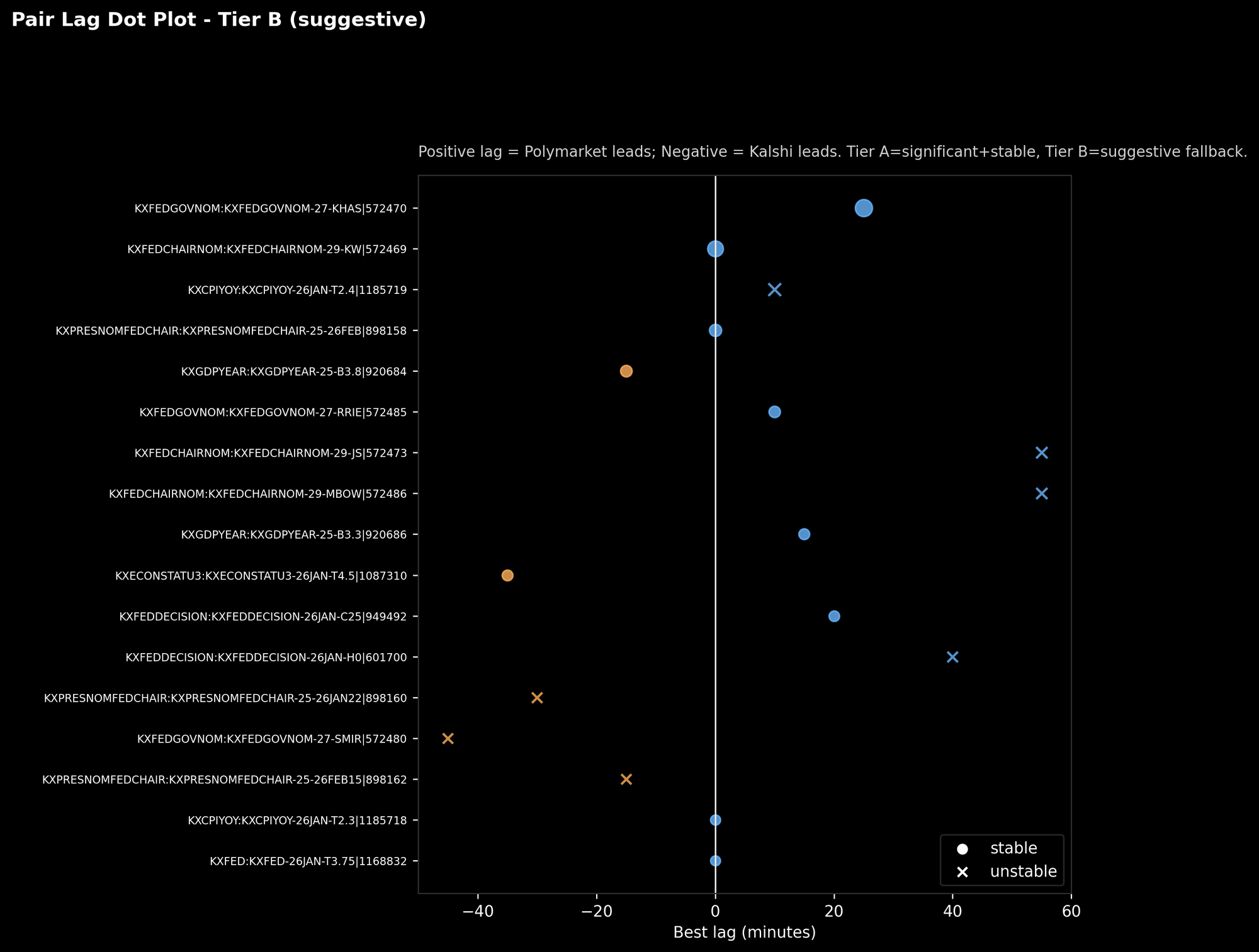
Caption: “Each row is a matched pair. Dot position is the best lag. Circle = stable, X = unstable.”
This is where it stops being abstract.
You can literally point to a pair and say:
- “This one tends to line up best when Polymarket is shifted ~25 minutes earlier.”
- “This one only looks good at 55 minutes, but it’s unstable, so we treat it like a rumor, not a fact.”
This plot is also useful for debugging. When you see extreme lags, you want to inspect those pairs first and ask:
- Is this a real lead?
- Or are we just seeing different liquidity patterns?
By topic: where the “suggestive” edge shows up
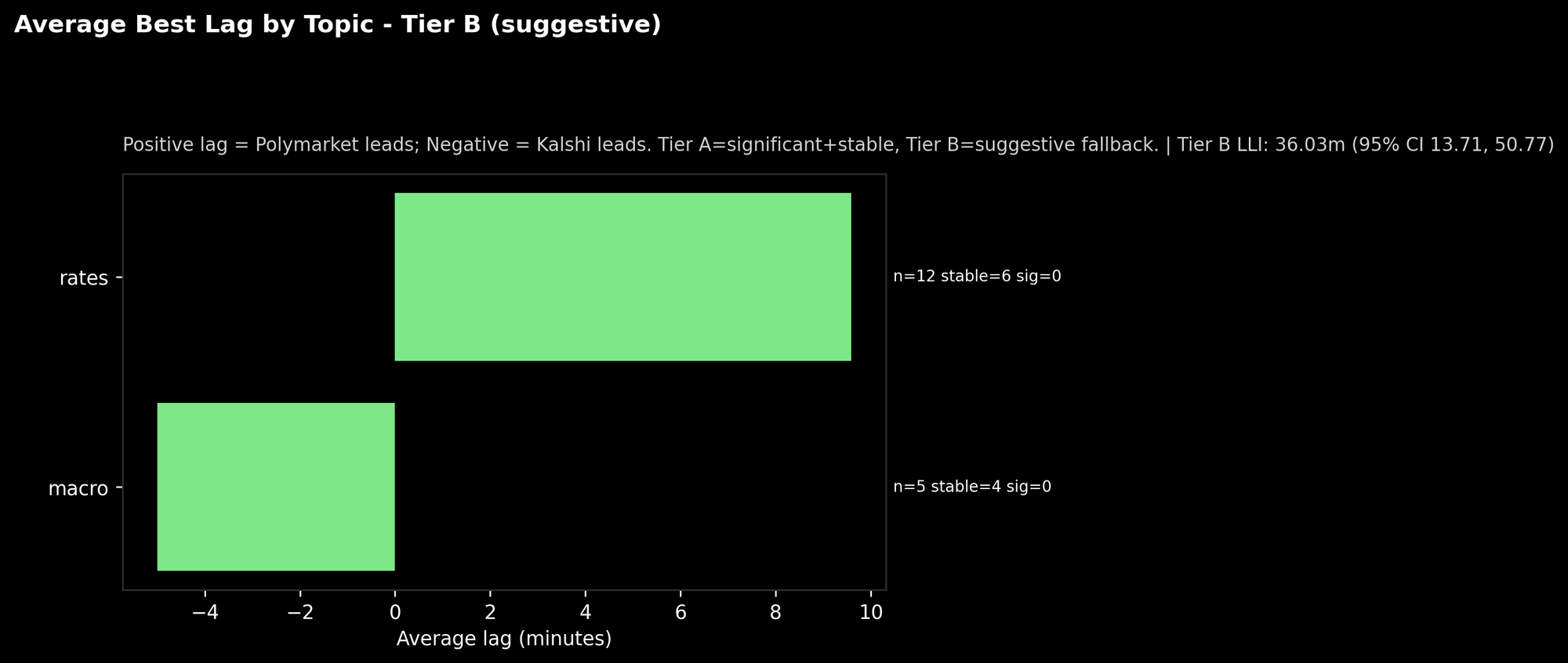
Caption: “Average lag by topic (Tier B). Also shows sample size and stability counts.”
In this run, the “rates” bucket leans positive. The “macro” bucket leans negative.
Two important caveats:
- The sample sizes are small.
- “sig=0” means none of these passed our strict significance tests this week.
So don’t read this as “rates always lead on Polymarket.”
Read it as: “if we’re going to hunt for consistent lead-lag, rates might be a promising sandbox.”
What “lead-lag” looks like under the hood
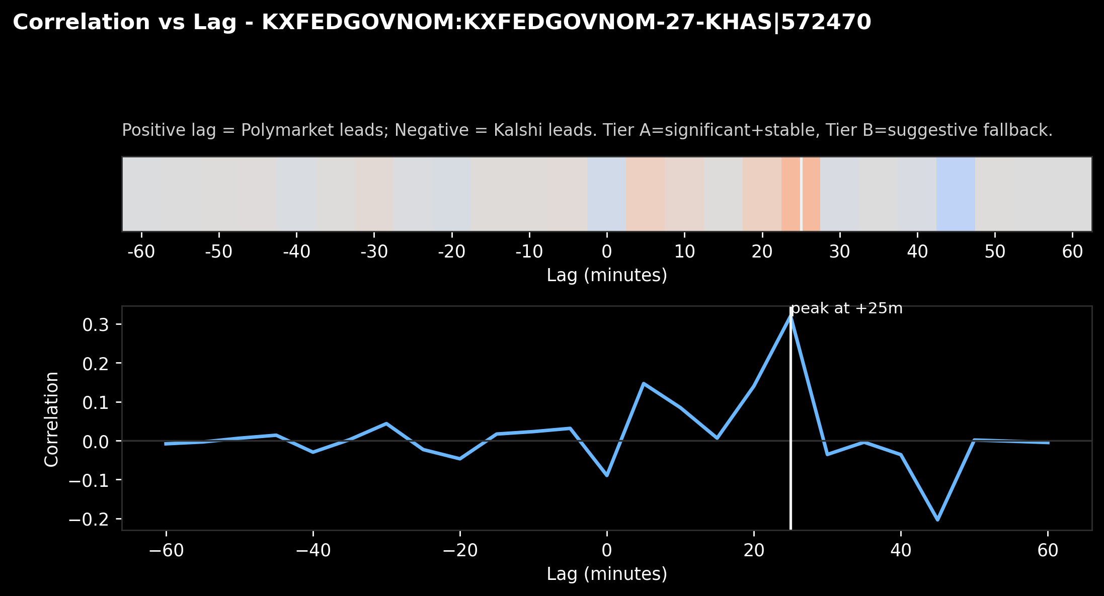
Caption: “Correlation vs lag for one pair. The white line marks the best-fitting lag.”
This is the honest engine room.
We slide one market’s changes forward/backward in time and compute alignment. The peak tells us where the best “echo” happens.
In this example, the peak lands around +25 minutes, meaning:
the series lines up best when Polymarket is treated as moving ~25 minutes earlier.
Is that trading edge? Not automatically.
But it’s the sort of “timing fingerprint” you can stack over weeks and see if it repeats.
A real case study (and a big lesson)
Let’s pick a tangible example: Judy Shelton as Fed Chair.
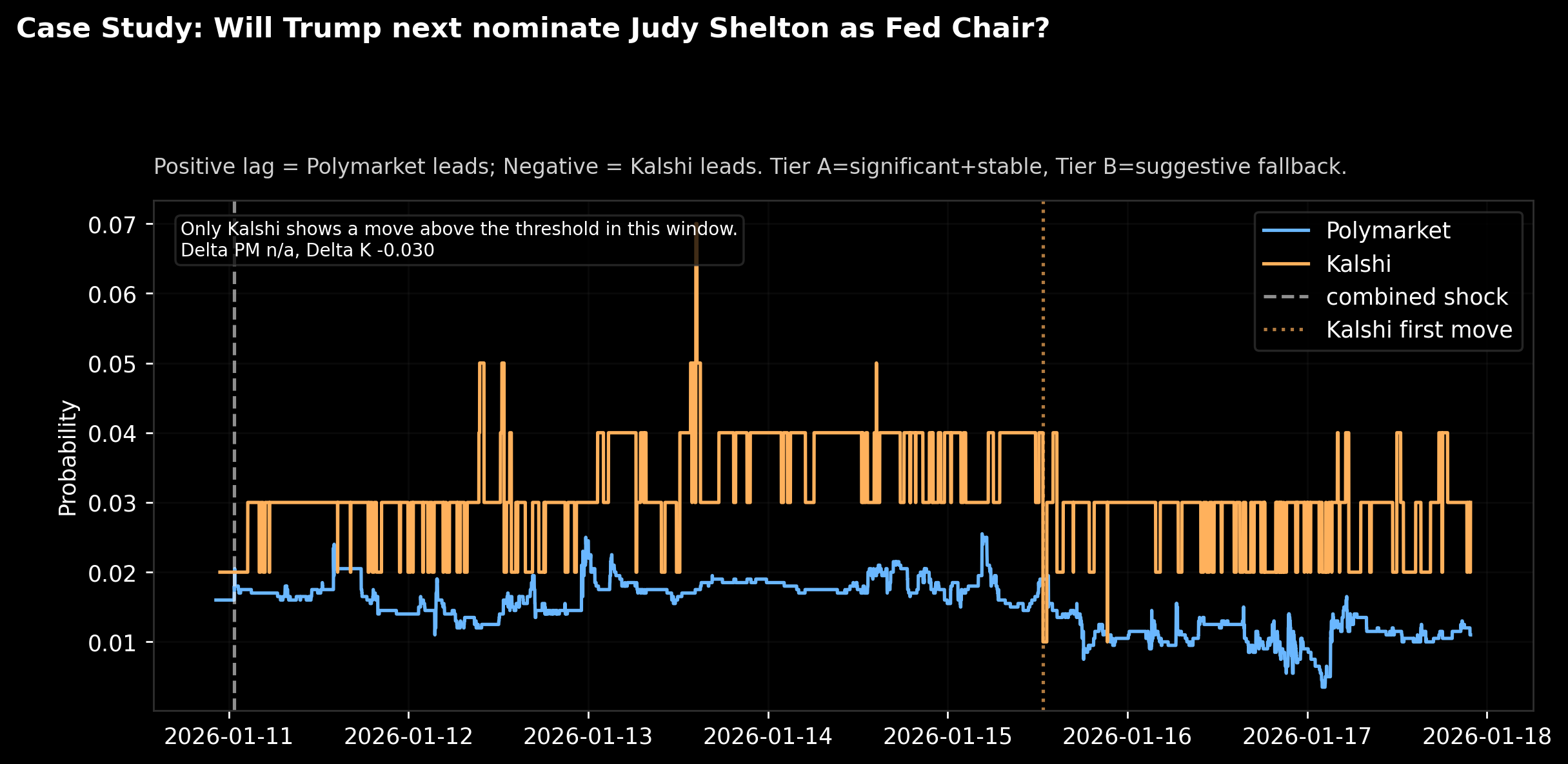
Caption: “Case study. Blue = Polymarket probability, Orange = Kalshi probability. Dotted line marks first threshold move, dashed line marks a ‘shock’ moment.”
What this chart is telling you:
- Both platforms price this as a low-probability event most of the week.
- Kalshi makes a clear move large enough to trip our threshold.
- Polymarket doesn’t make a matching threshold-level move in that window.
That’s why the annotation says:
“Only Kalshi shows a move above the threshold in this window.”
This is a feature, not a bug.
It means our system isn’t forcing a “who led who” story when the data doesn’t support it. Sometimes one platform is simply more active on a niche market. Sometimes the pricing is structurally different. Sometimes one market is illiquid.
If you want to build a serious signal pipeline, you need this kind of refusal mode. Otherwise you’re just generating confident nonsense.
So what did we actually learn?
- We can scrape, match, align, and analyze these markets reliably.
That alone is valuable. Most people stop at screenshots. - This week didn’t produce “publishable certainty” on who moves first.
So LLI is N/A under strict significance rules. - But the suggestive signals point to Polymarket moving earlier by about half an hour in this window.
Not a victory lap. Just a promising lead. - Case studies show why this is tricky.
Sometimes only one platform makes the meaningful move. That’s not lead-lag. That’s microstructure and liquidity showing up.
Why SimplyfAI cares (and what we’ll do with this)
We build data pipelines that turn noisy reality into usable signals. Prediction markets are an unusually clean “belief stream” because they condense thousands of tiny opinions into a time series.
Here’s how this becomes a SimplyfAI pipeline ingredient:
- Event velocity features: how fast odds change after a headline
- Divergence alerts: “Polymarket moved but Kalshi didn’t” (or vice versa)
- Cross-market consistency checks: confirmation or disagreement across platforms
- A weekly lead-lag dashboard: not for flexing, for learning the shape of these markets
- Downstream models: macro nowcasting, narrative momentum tracking, “what’s waking up” detectors
We’re not claiming “free money.” We’re claiming something more useful:
a new sensor for the world, and a repeatable way to harvest it.
This whole exercise started as a fun “let’s get familiar with the data” project. But that’s how good pipelines begin: you build a toy, you learn where it breaks, and then you upgrade it until it becomes a product.